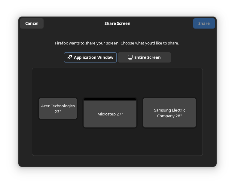

I don’t think it is that simple. I think that outline is about the “focus”. So if I press enter it will activate that tab, if I press tab it will move the focus to the “Entire Screen” tab.
The UX issue is that there are two concepts of focus in this UI. There is “which tab is active” and “what UI element will pressing enter activate”. These two are not sufficiently differentiated which leads to a confusing experience.
Or maybe there can just be no keyboard focus indicator by default, but that may be annoying for keyboard power users. But this is generally how it works on the web, you have to press tab once to move keyboard focus to the first interactive element.


Yeah. I like old school tabs that were clearly attached to the thing that they switched. I definitely prefer the KDE UX here.